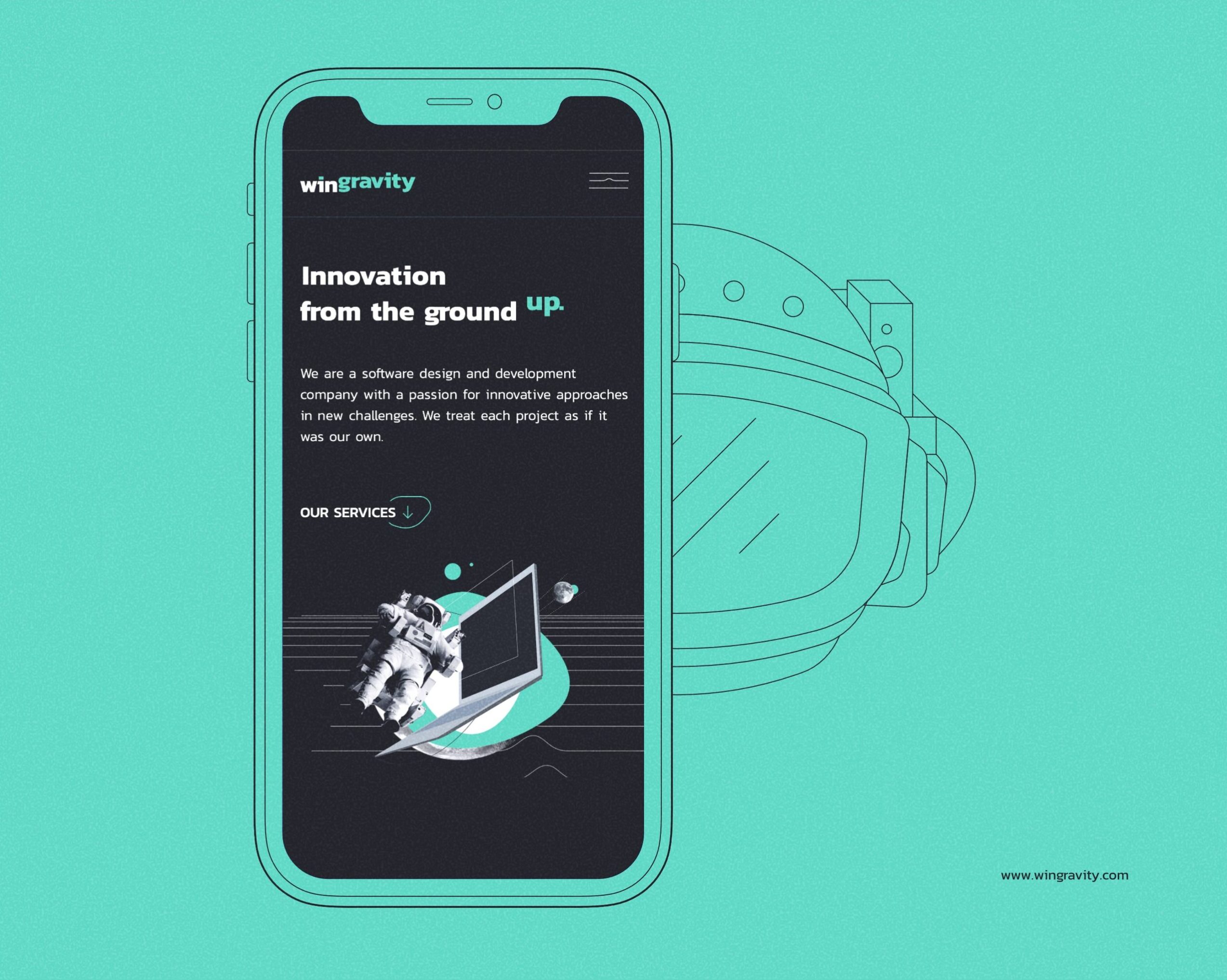
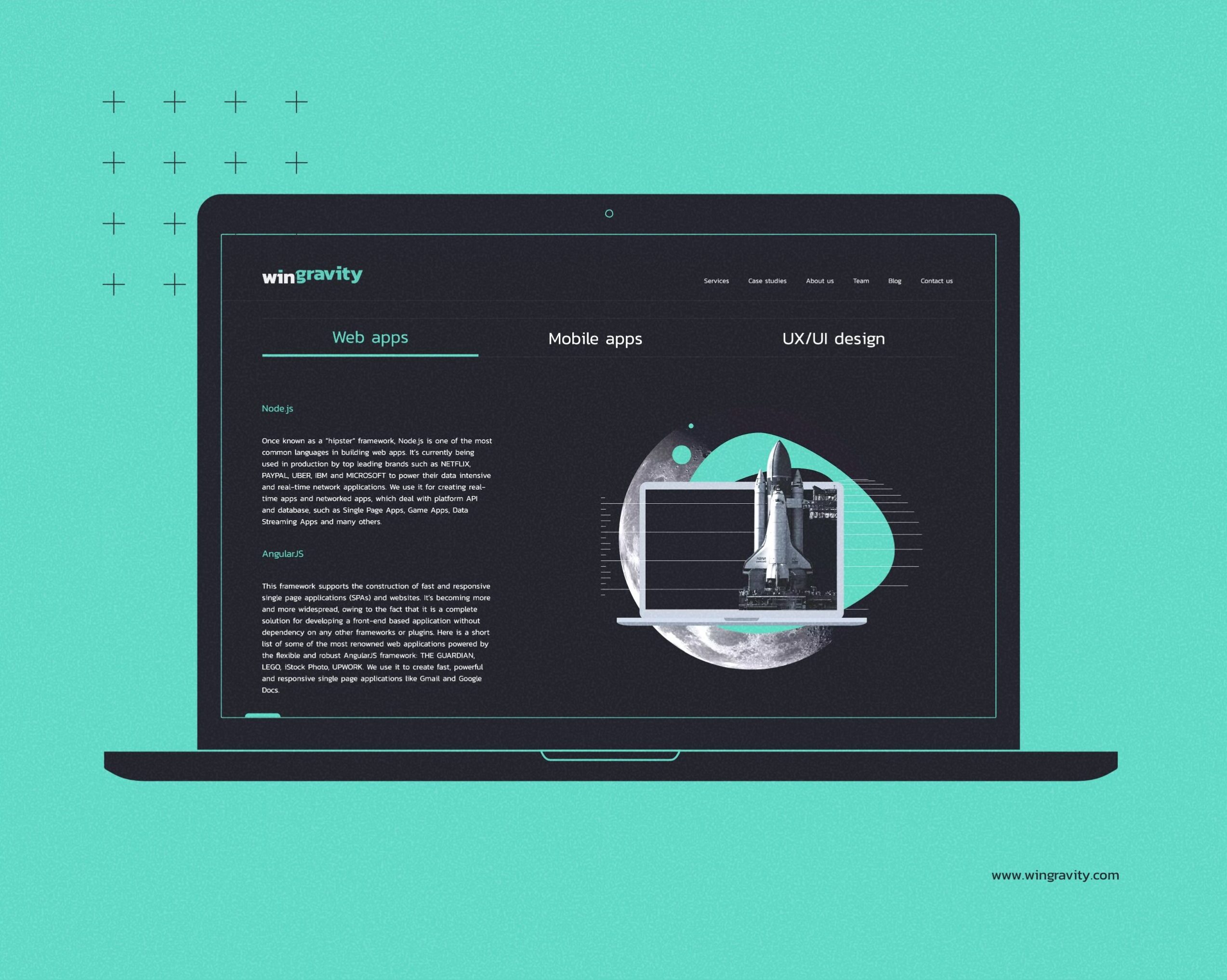
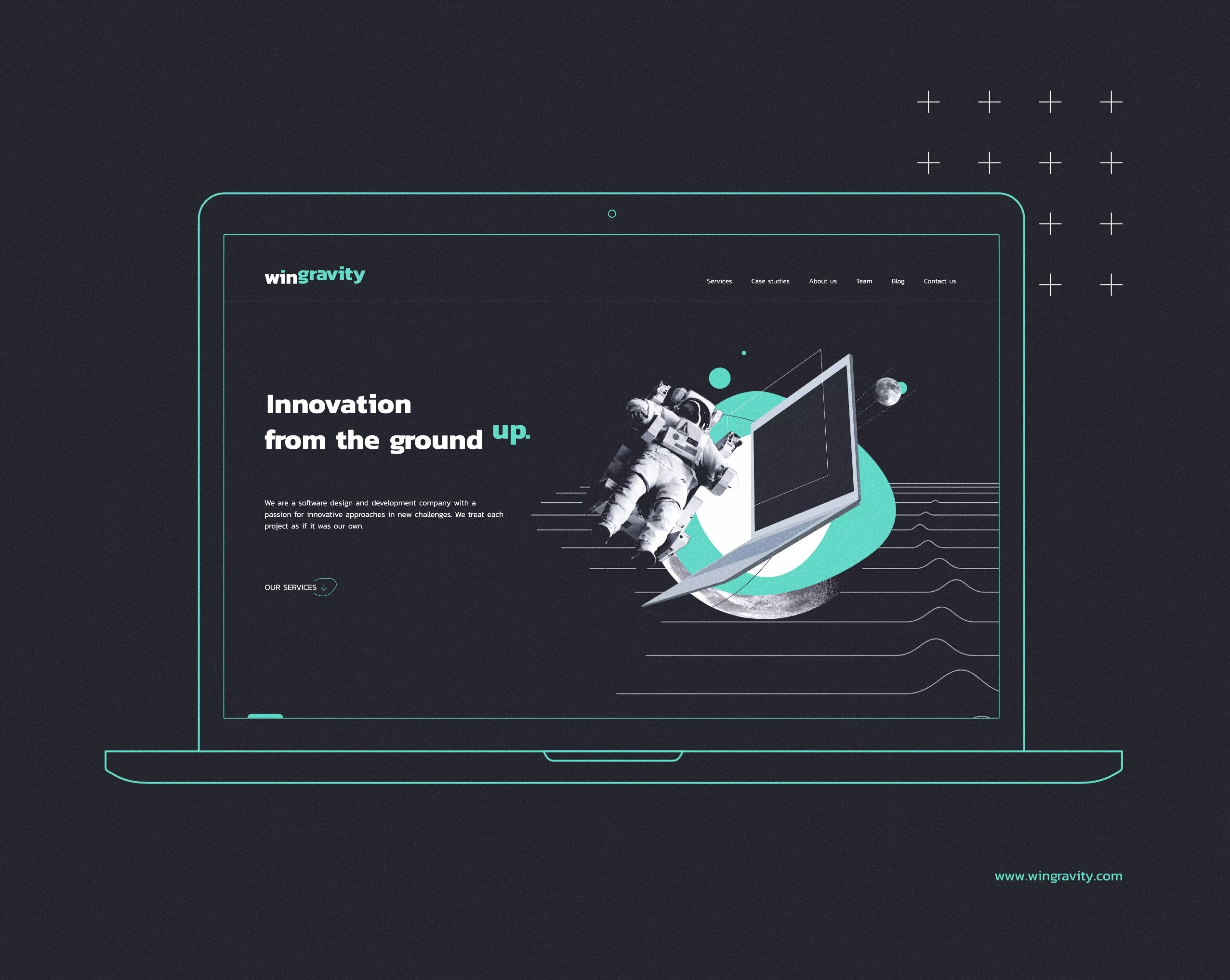
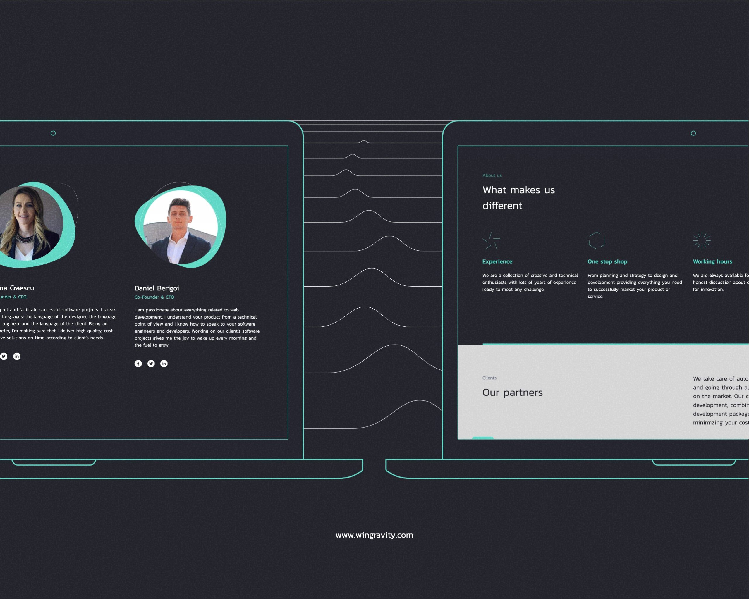
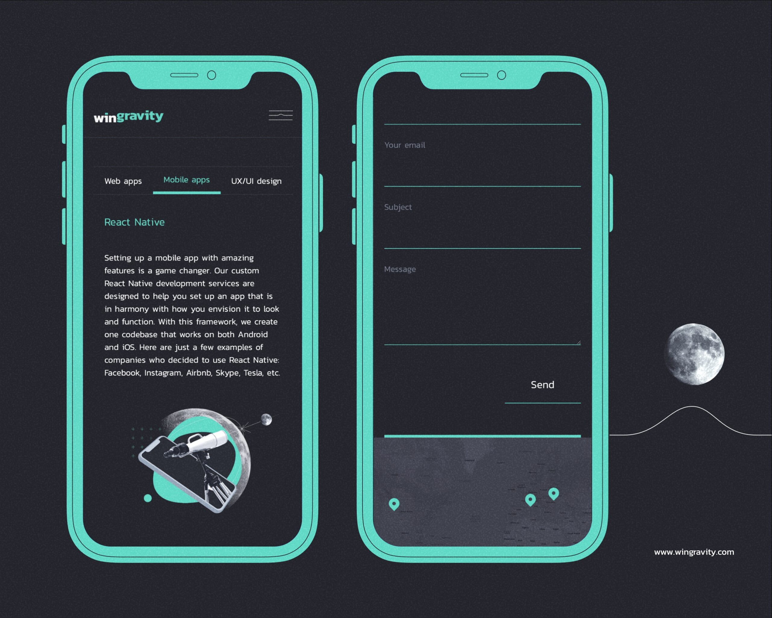
Software development companies often need to differentiate themselves through their approach. Wingravity does just that, by handling projects as if they were their own and pushing towards innovative solutions where others fail. They needed a bold and friendly identity, far from the heavy corporate feeling.
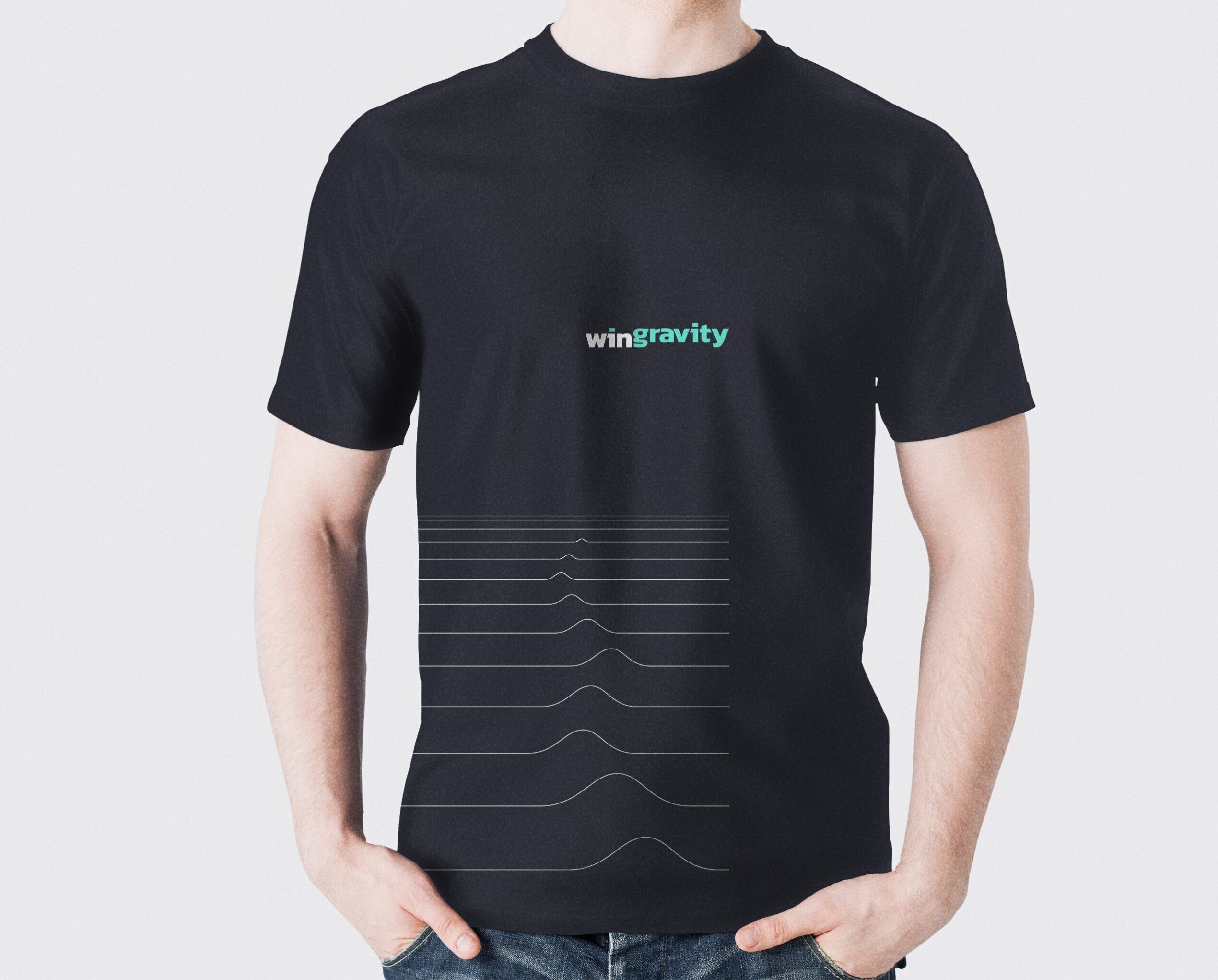
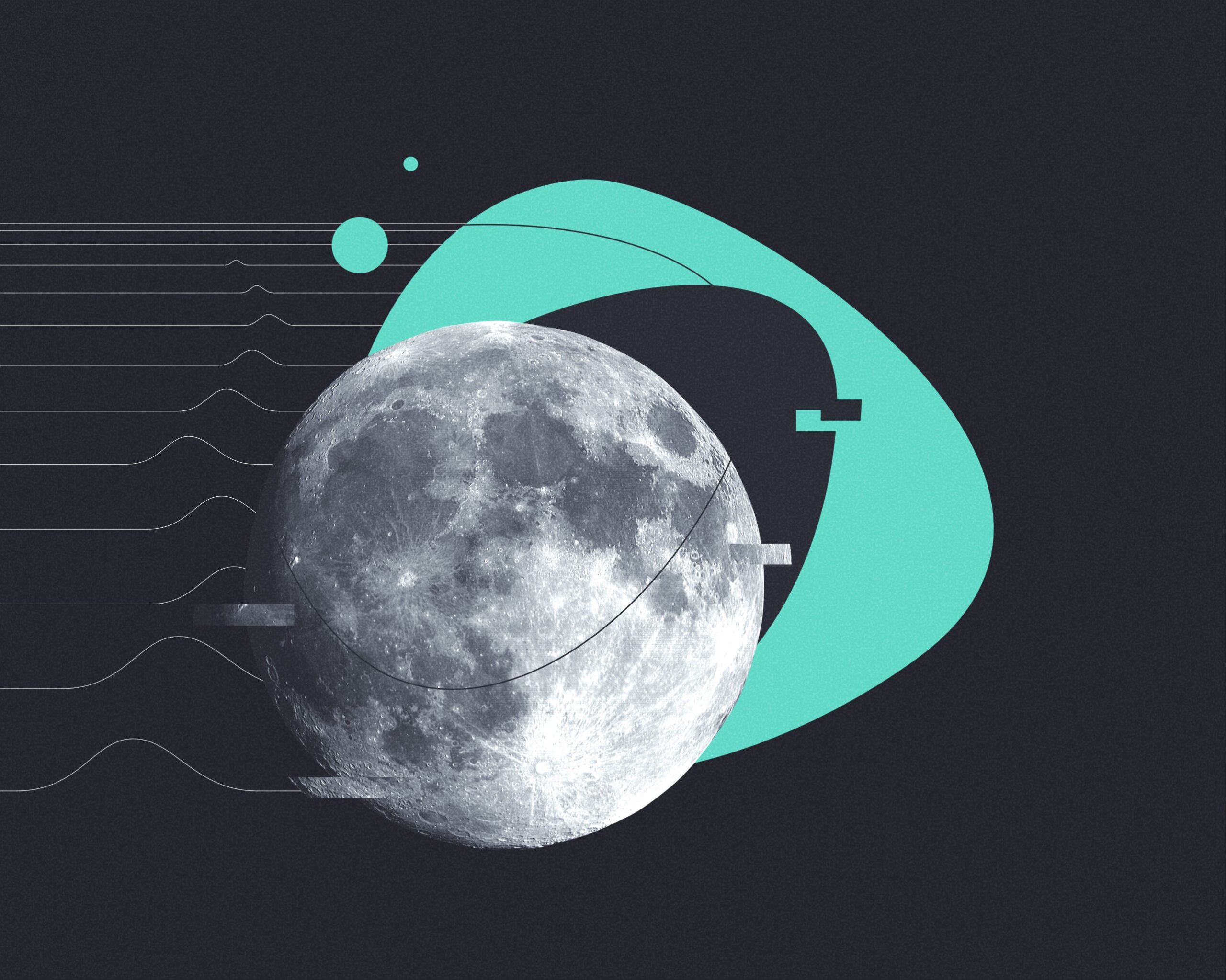
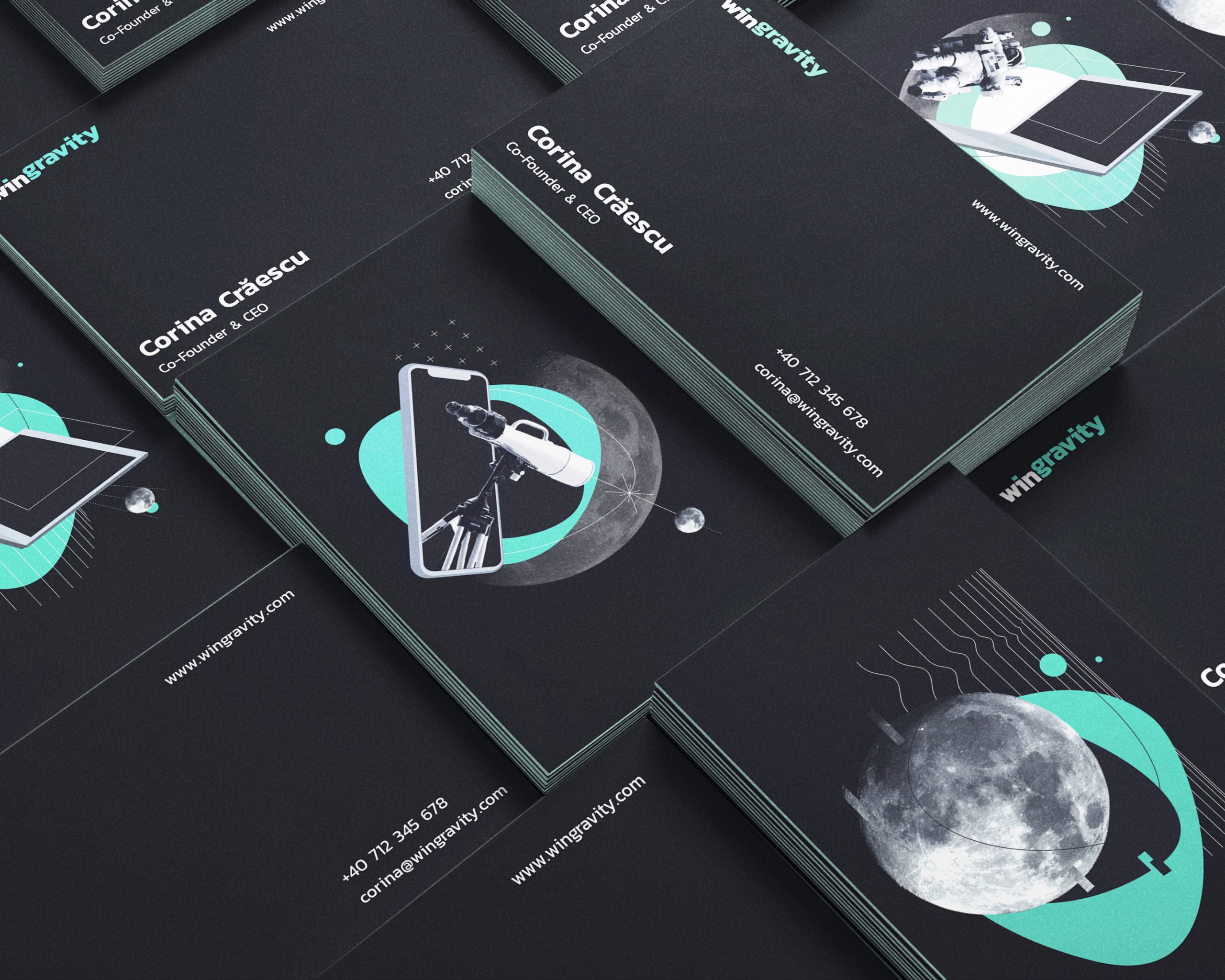
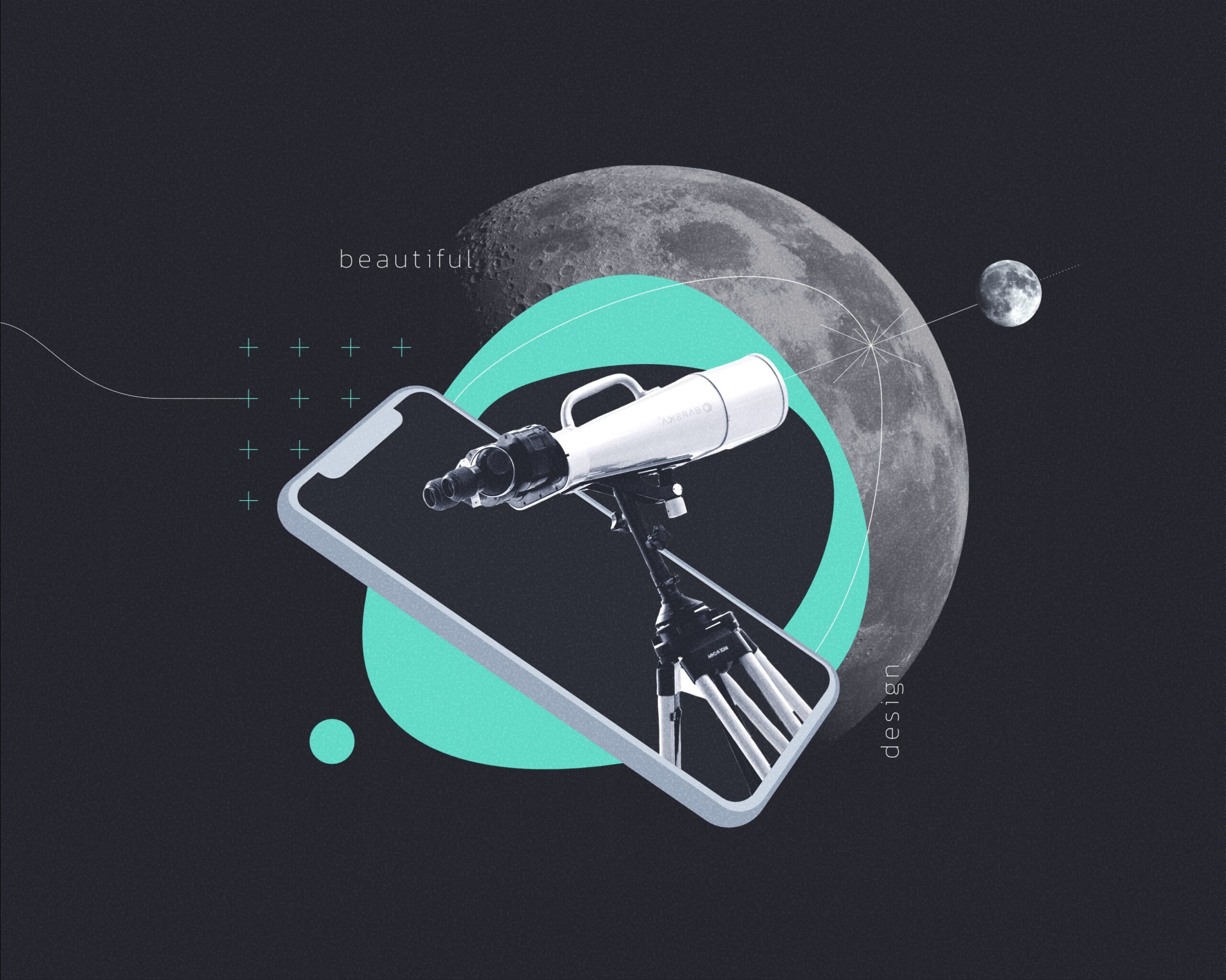
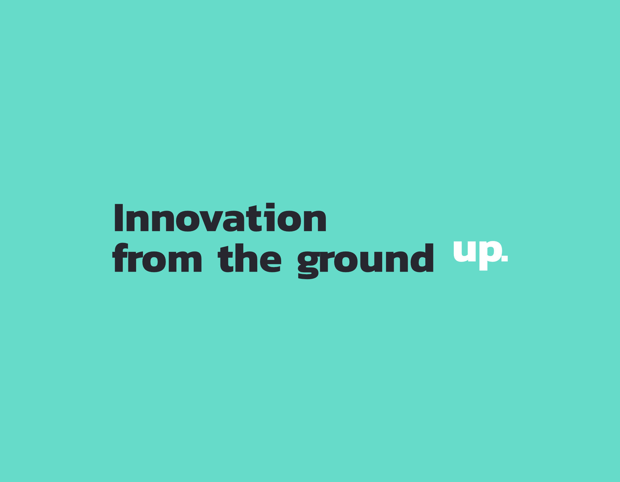
We played on the brand name and the idea of overcoming gravity through a cosmic-science brand feel. We elevated part of the logotype to create contrast and defy the meaning of the word gravity itself. The visual style is dark with a touch of turquoise, combines cutouts and blueprint style graphics to convey a sense of conquering the unknown.